Case Study Leibniz University Hanover

User-Centered Design
Website redesign- Central website with 400 additional sites
- UX design for mobile and desktop
- Prototyping
- Online survey
- Iterative usability tests

The Leibniz University Hanover has a long history and is one of the leading technical universities in Germany. It brings together 30,000 students from more than 100 countries and scientists from 150 institutes. It offers an extensive range of courses, from architecture to sports science. Central fields include biomedicine, quantum optics and gravitational physics, industrial engineering, and teacher training.
The university cooperates strategically with Technical University Braunschweig, Hanover Medical School, the Albert Einstein Institute for Gravitational Physics, and the German Aerospace Center.
Website Relaunch
As diverse as the Leibniz University Hanover is, as extensive is its web presence, which comprises not only the main website, but about 400 additional, decentral sites. In cooperation with the university’s developing agency, it was our task to do a complete redesign that would bring structure to the multitude of websites and improve the user experience of the central site. The project’s goals were:
- Improve mobile use with a new responsive design.
- Make content easily findable for the different user groups.
- Standardize web page types to make the editors’ job easier.
- Make the sites accessible for all users.
- Sharpen the brand of Leibniz University Hanover in the digital context.
Beside the relaunch of the website and employee portal a new system for prospective students was implemented that provides all the information on the courses in one place.

Understand user needs
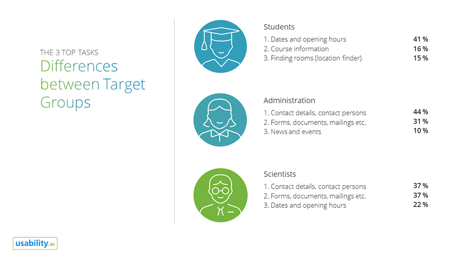
To get a better idea of how to achieve the goals of the relaunch we first analyzed the status quo. In a big online survey, we measured the current user experience and asked the users which tasks they are trying to solve on the website and which contents they are looking for (Top Task Analysis). Furthermore, we asked them to point out strengths and weaknesses of the website. This approach helped us get a clear understanding of what needs to be improved and which contents are most relevant from the users’ perspective.
Together with the university’s project team we prioritized the target groups and collected existing knowledge about the users with the help of Empathy Maps. The results were recorded in the form of Proto-Personas that helped the team focus on the users during the entire design process. Another step was a competition and content analysis. We discussed best practices with the project team and defined content types in order to limit the number templates for the editors.
Finally, we also addressed the marketing strategy and the brand image the university wants to convey on their web presence, which served as basis for the site structure, content, and the use of language.

User-centered, not organization-centered
Following a user-centered design approach, and based on the results of the analysis phase, we developed a new website structure, navigation concept, and standardized templates for all content types. In multiple stakeholder workshops we involved the project team during the whole conception phase. With the help of prototyping and early visualization through wireframes the different stages of the concept were accessible to everyone which allowed us to react quickly and early to the team’s feedback.
It was also essential to include users in several usability tests in order to review whether the concept was meeting the users’ needs or required revision. Thanks to the prototyping approach there was no need to create a separate click dummy for the testing, we could simply use the wireframe prototype. The usability tests were conducted partly remote, partly in the lab, on desktop and mobile devices, and included three different user groups.

An iterative approach
The insights from the usability tests were immediately incorporated into the concept. For instance, we revised the content structure on the second and third navigation level to better match the users’ mental model. Furthermore, we connected related contents better by cross-linking them and highlighted important entry points by positioning them prominently.
After the concept was developed, we tested the finished website again to identify the last usability issues and eliminate them before the launch. The result of this approach was an extensively examined website concept that supports the needs of the different user groups.

Better for the users, better for the editors
The improved usability benefits all target groups of the Leibniz University Hanover. Students can find content easily and faster. The new course finder is focused on the needs of prospective students and provides information on more than 180 courses in one place. The university’s employees now have easy access to frequently used information. And finally, the new website makes the job of the over 1000 editors easier as well. Clearly defined layouts facilitate producing and managing content. We are happy that we had the chance to support the Leibniz University Hanover on this important journey.

 Diakonie Katastrophenhilfe: Website Relaunch