Case Study Diakonie Katastrophenhilfe

Website Relaunch Diakonie Katastrophenhilfe
Concept and Design- Responsive Relaunch
- UX Design
- User-Centered Design
- Requirements Analysis
- Agile UX Testing

Diakonie Katastrophenhilfe - the humanitarian aid organization of the Protestant churches in Germany - supports people in need worldwide. In cooperation with local organizations, Diakonie Katastrophenhilfe focuses on rapid and sustainable aid in crises such as natural disasters, wars and conflicts.
The website of Diakonie Katastrophenhilfe is a central channel for the organization to inform about projects and collect donations.
The previous version of the website was outdated and no longer fulfilled this purpose properly. Furthermore, the website was not responsive. Thus, Diakonie Katastrophenhilfe asked us to develop the concept and design for a website relaunch. And since we work according to the principle of User-Centered Design, the user took center stage in every phase of the project.
Status Quo
As we had already conducted a usability test of the Diakonie Katastrophenhilfe website and had been working with their sister organisation Brot für die Welt for some time, we had already a good understanding of the users' needs and existing problems. In addition to a modern and responsive design, the biggest challenge was to communicate the topicality of the aid missions and to make the impact of their individual donations transparent to the donors.

Collecting Internal Requirements
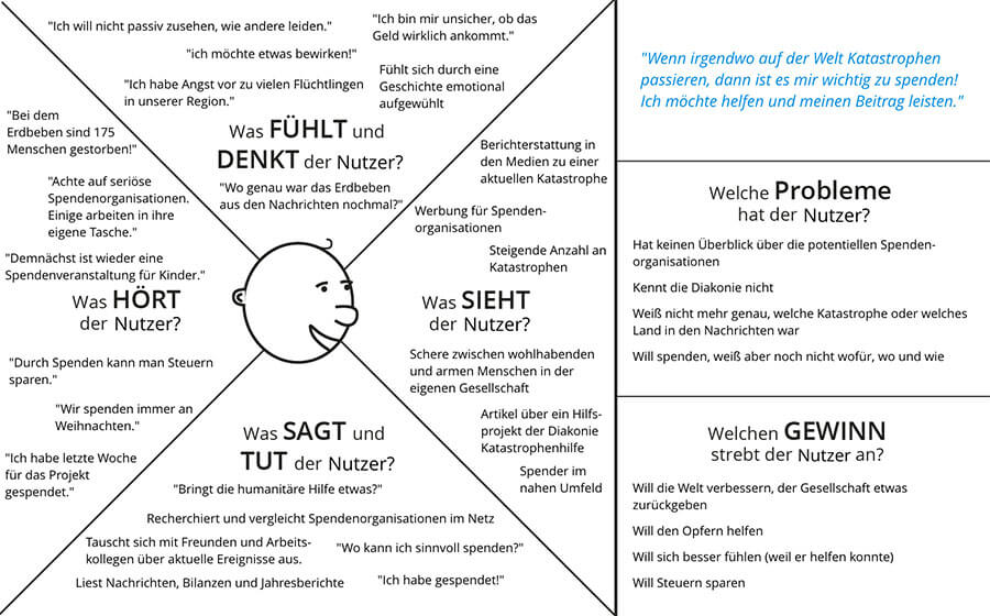
The first step in developing a new concept must always be the requirements analysis. We already knew the user requirements. But the business goals are of great importance as well. In a kickoff workshop with the responsible stakeholders at Diakonie Katastrophenhilfe, we determined the goals the organization was pursuing with the website and the user goals that were to be met. The most important aspects were, among others, to be perceived as a serious and competent aide in the event of disasters and to create transparency for the donors.
Afterwards, we prioritized the site contents in a stakeholder workshop with all project members. Using the Core Model and the Empathy Map, we determined the pages that are most important and the content that needs to be presented from the stakeholders' point of view – sorted by priority.
First Concept Design
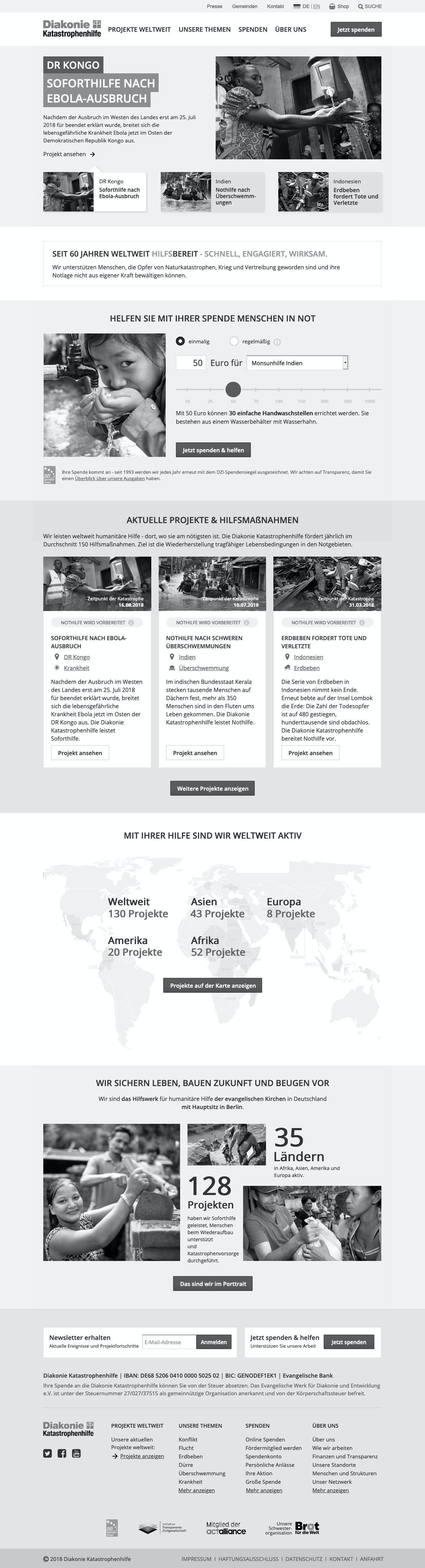
Based on this and the findings from the previous projects, the first conceptual draft was developed. First, the basic information architecture was created. Based on the prioritization of the website content in the stakeholder workshop, we were able to set the focus on the projects and the goals of the most important target group – private donors. This resulted in a clear and coherent main menu.
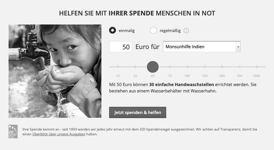
The next step was to design the concept for the three most important pages – the home page, the project details page and the project overview page (all projects worldwide). In order to illustrate the effect of the donations, we developed a donation slider that gives an example for the use of the donation, depending on the amount. On the project pages, the concept also included a content layer that informs about the specific actions being taken to help the people – illustrated with pictures. In order to demonstrate the topicality of the project, current news about the project are displayed as well.
In order to create a meaningful concept that works in real life, we worked with real content that originated from selected donation projects right from the start. In the beginning, we deliberately refrained from a detailed visual design in order to focus on content and functionality.
Iteration #1: First Landmark
One of the principles of User-Centred Design is the early and iterative evaluation of the concept. Therefore, we already conducted the first usability test at this point. In order to avoid delays and to keep costs to a minimum, we chose agile UX testing. This means: One testing day, five individual tests and live evaluation after each session. The usability tests were carried out by two of our user research experts. The concept team observed the testing live and could take the results with them at the end of the day.
This first round of testing was particularly important to validate the concept of the basic website structure. The participants even commented positively on the clear structure. We were also able to fulfill Diakonie Katastrophenhilfe's most important objective – to demonstrate trustworthiness. Among other things, the donation examples, which were rated positively by the participants, contributed to this.
Nonetheless, not everything was perfect yet. Besides minor difficulties in the interaction with the donation slider, the donation examples were overlooked sometimes. However, we expected the visual design to be able to solve this. In addition, the participants had difficulties navigating to the project overview.
“The site appears trustworthy, well-structured and committed. I have the feeling that my money will go to those who need it.“
- Quote from a participant

Iteration #2: Reviewing and Finalizing the Visual Design
After a few weeks the second testing round followed – agile as well, but more comprehensive. In addition to the revised pages, new pages were tested (Our topics, About us). And part of the test was done on the smartphone to evaluate the mobile navigation concept.
The overall result was better than in the first usability test - the new pages received positive reactions and problems from the previous testing round could be solved. The navigation on the smartphone worked without any problems.
The findings from the second test were tackled in another iteration from which the final concept emerged. Parallel to finalizing the concept, we started with the visual design. Early on, we used Mood Boards to determine the direction of the design and the values Diakonie Katastrophenhilfe would like to convey. On this basis, we selected suitable imagery and typography and finalized the design. Finally, we handed over the complete, designed concept for implementation.
Final Rehearsal & Go-live
In order to check whether unforeseen usability issues had developed during implementation or due to the design, a final usability test was carried out before the launch. Since the major questions had already been examined in the concept phase, we were able to address detailed problems and design questions at this point, which we prioritized together with the client. For example, we decided on a slight change to the homepage design at short notice. It also turned out that there were not enough content and donation examples for some of the projects.
To ensure that the donation slider can fulfill its important purpose, we provided Diakonie Katastrophenhilfe with guidelines for the creation of donation examples.
Three weeks later the final website went live. Up to this point it had been tested in three usability tests and optimized based on user feedback. The result is a modern website that is easy to use on all devices, that conveys a positive and trustworthy image of Diakonie Katastrophenhilfe and provides transparent information on the projects and the use of the donations.

 Volkswagen AG: Agile User Days
  Leibniz University Hanover: User-Centered Design